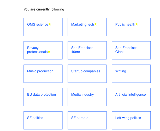
Is there a way to have all of the topics/anchors I follow in a menu of some sort at the top of the page instead of scrolling through every anchor three articles at a time until I find what I’m interested in? Even having the three articles per anchor next to each other horizontally will help us see more anchors quickly and avoid so much scrolling.
Hello, @AngelaP03123235! Thanks for the question.
That’s the intent of our browse button at the top:
Does this address the need?
Best,
Colin

